


A unique identity for a more unique sport and world (W) championship event, hosted by the Freestyle Player’s Association (FPA).

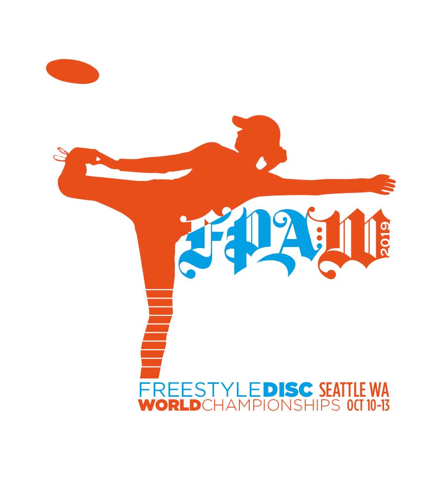
We set out to create something that aligned with the intrinsic nature of the sport: unusual, dynamic, energetic, flowing and spirited.
There’s an authority and formality implied with gothic lettering, so that when used in this context, it’s turned on its head. At the same time, like the sport, its individual parts are strongly gestural.
Organizers where very pleased in this approach, allowing only the typography to handle the main tone and expression of the event.
An emphasis on women
Attracting more women players (and welcoming crossover frisbee players) to freestyle disc has long been a prime objective for the FPA. This need informed the choice to feature Juliana Korver, who is considered one of the best new freestylers, and well known as a multi-title disc golf world champion.
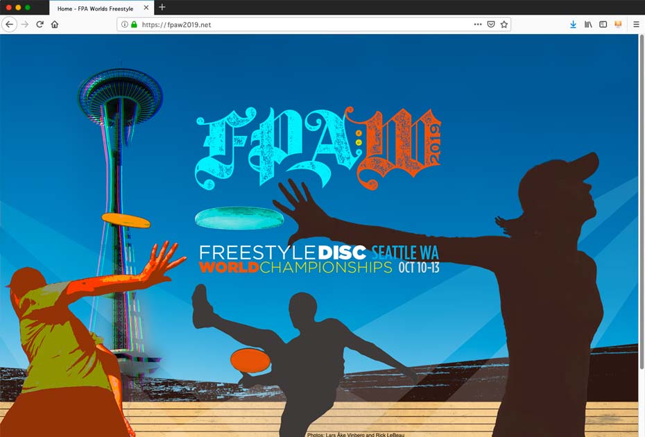
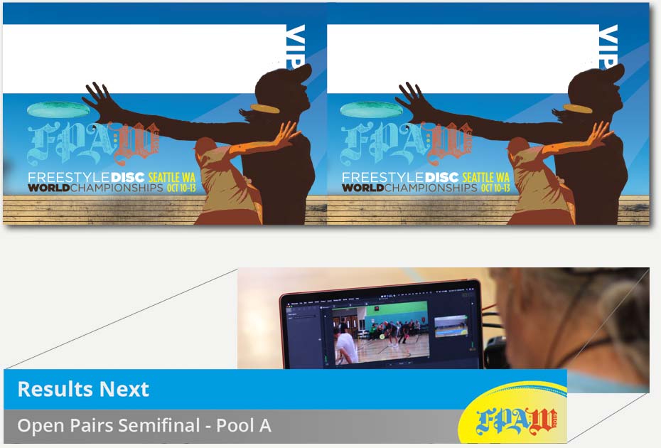
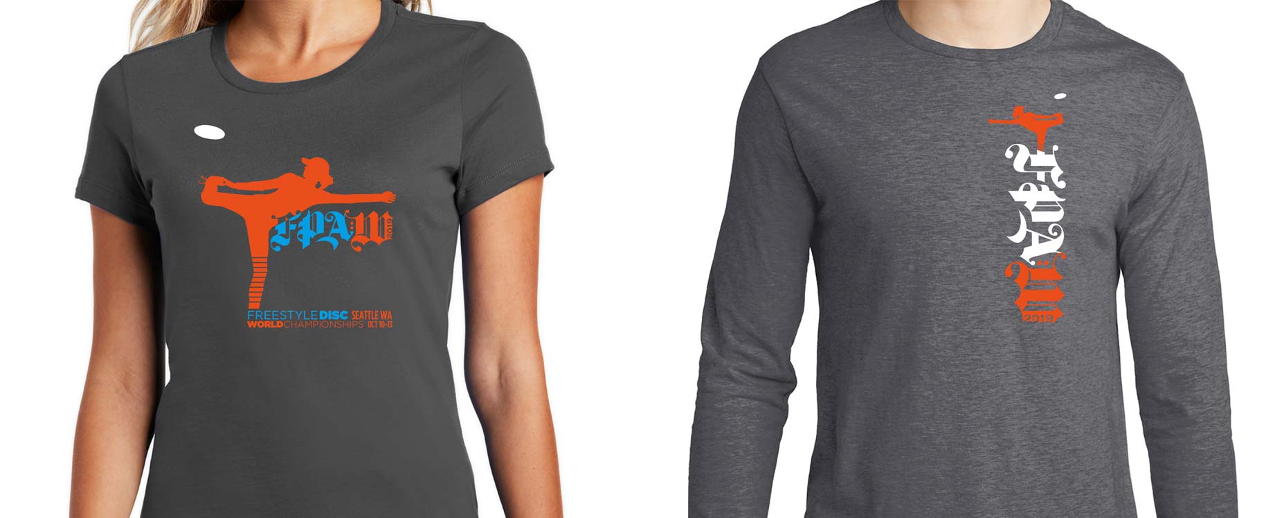
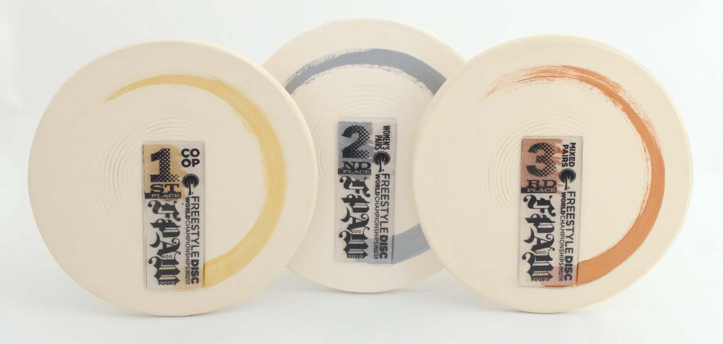
The boldness of the letterforms serve as a central focal point to connect all material associated with the event, including disc, website, apparel, badges, tags, bags, and trophies.