


We worked closely with aerospace super heroes to build genuine character and meaning into their true identity.
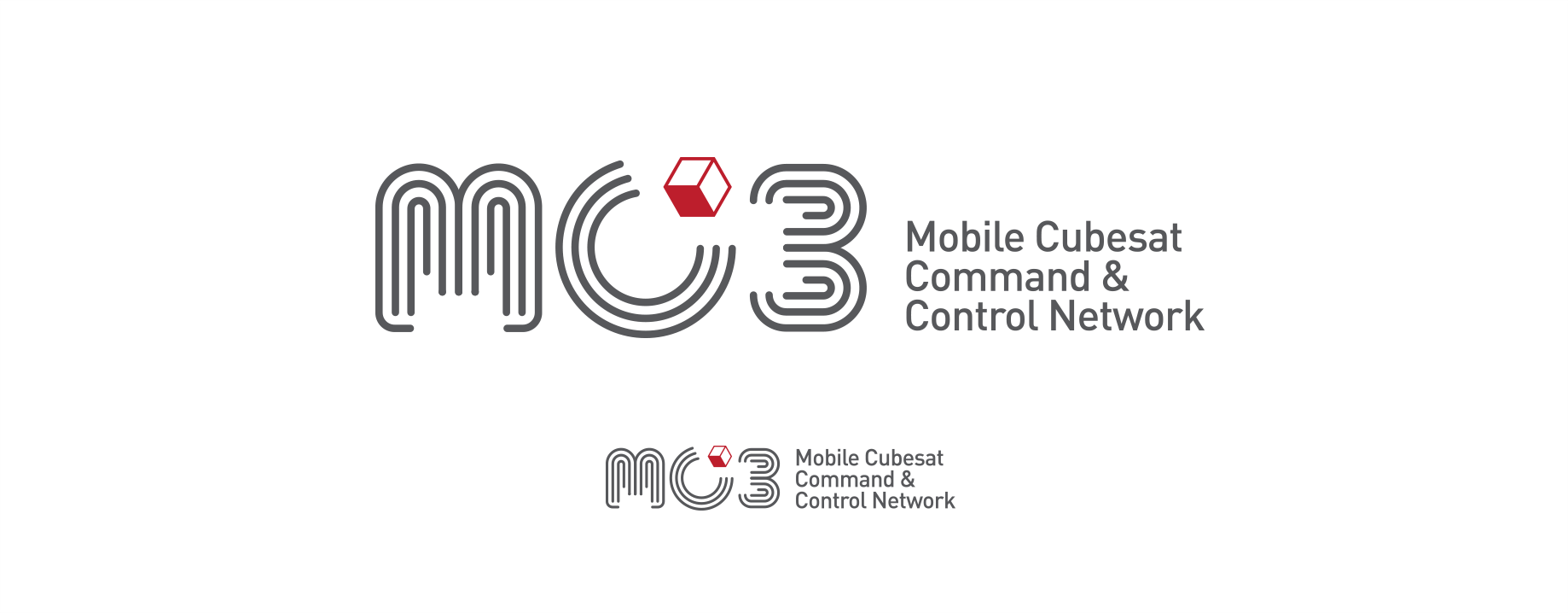
MC3 Logo (Mobile CubeSat Command and Control)


In a broader sense the solution is meant to align with the MC3’s enthusiasm for discovery and perpetual state of ‘chasing the future’.
Their ground station network is fielded at participating institutions, providing operators with access to their satellites from any location with an internet connection.
“Robert has an incredible ability to transform ideas and feelings into a tangible product. He was able to successfully capture the technical depth of our product and combine it with a sense of joy that our team feels about the product into a logo that communicates both.”
– Noah, Lara, and Gio, the MC3 Team
DISCOVERY
As revealed through a brief discovery phase, the MC3 team had been long interested in an identity that could visually represent a collaborative community of engineers and experts, and the connectivity and expertise at the core of their network. Their enthusiasm for creative problem solving, space exploration, and its mystifying nature was also clear, and became part of the creative brief as well.
DESIGN
Regarding design it became important to find a vernacular that touched on a truth about their work, what it meant to them, and what it produced. Naturally, geometry was a particularly appropriate place to experiment with graphic elements or letterforms. As is typical for a logo, we focus on what might offer promice conceptually, but cast the net wide enough to spark conversation and reveal what’s hitting and what’s missing.
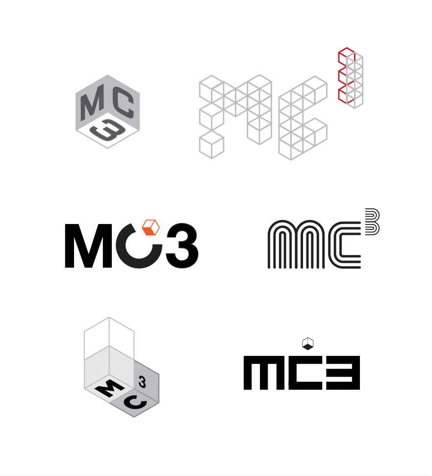
Early Concepts
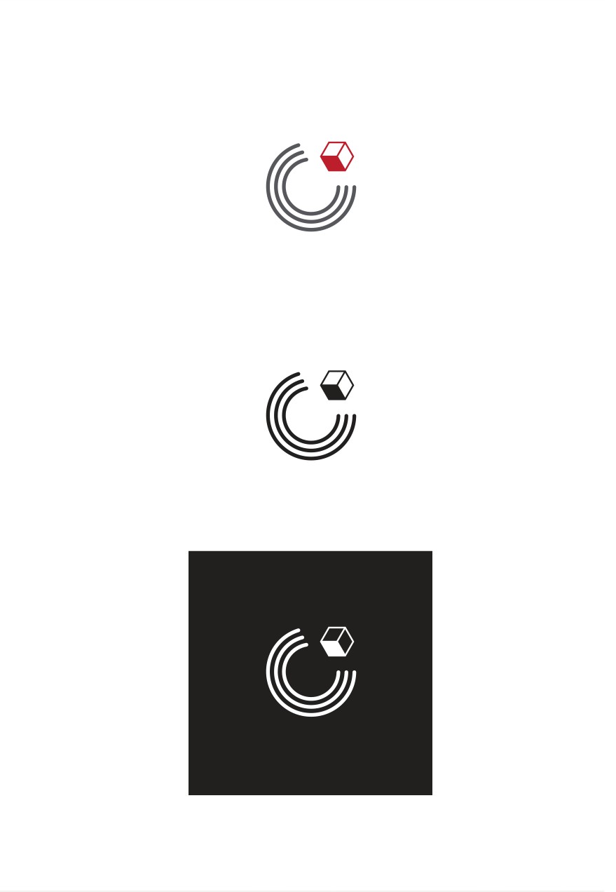
From early rough concepts, a custom style that could express itself through letterforms was strong enough to pitch. Utilizing concentric lines, it was relatively more bold and unusual, with a clear space or tech-centric feel, implying wiring, conduit, and ‘alignment’.
In light of these strengths MC3 was ready to see it developed further. The team gravitated to several subtle layers of meaning that avoided ‘conceptual crowding’, including the 3 nested C’s representing the ‘meatiest’ part of the name.


Inspiration for the final concentric lines approach originated in part from space & sci-fi fantasy environments found in film that have repeatedly offered a prophetic vision of what the future might look like.
In this way the logo’s final design can be thought of as a subtle nod to MC3’s relationship with the future, and its ongoing work to bringing it closer.
Which Design Principles?
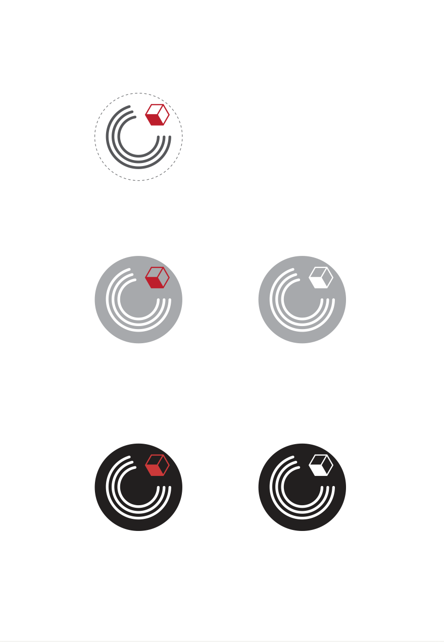
We utilized several universal principles of typography, including extending curved shapes below the baseline to achieve optical balance.
Among several universal design principles, we intuitively applied Ockham’s Razor1, ensuring a simple pure feel, and that no unnecessary visual elements distracted or competed with the design.
1Lidwell, W., Holden, K., & Butler, J. (2003). Universal Principles of Design: 100 Ways to Enhance Usability, Influence Perception, Increase Appeal, Make Better Design Decisions, and Teach through Design. Rockport Publishers.