


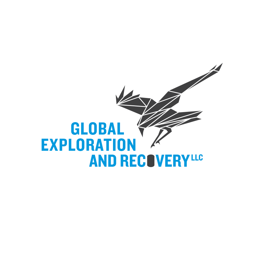
GEaR (Global Expedition and Recovery) Logo Reboot
GEaR strongly identified with the raven for its ability to innovate, adapt, and navigate. An updated identity brought an opportunity for a more “active” representation.
GEaR is a group of skilled mountaineers with experience spanning search and recovery, geophysics, medical mountain rescue, and expedition medicine.
GEaR was interested in the idea of a logo reboot, but at the time the resources weren’t available. Robert Boulware (PTC Design Lead) being a Navy veteran himself, was so taken by their lost veteran recovery mission, decided to take on the challenge regardless. “I had an idea in my head and just had to see it”.
This completely unique logo is designed to raise their stature and bring additional meaning to one of their original recovery missions: to locate, recover, and repatriate 3 heroic American aviators buried in glacier ice in Greenland, lost since WWII. Their Grumman Duck amphibious airplane disappeared in a storm during its (2nd) daring attempt to rescue the crew of a downed B-17 using an audacious, untested ice landing technique. Previous missions have brought the team to the very edge of confirming the location of the wreckage.
About the design: A more substantive symbol
GEaR strongly identified with the raven for its ability to innovate, adapt, and navigate. An updated identity brought an opportunity for a more “active” representation. The look and feel aligns with the determination and readiness of the team, and offers a bump to their operational and logistical street cred. The raven locating and reaching for the dog-tag buried in glacier ice is a reference to their original mission to recover the remains of pilot Lt. John Pritchard, radioman Benjamin Bottoms, and U.S. Army Air Corps Cpl. Loren Howarth.
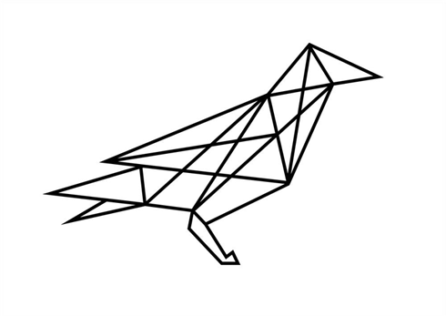
The rendering style borrows from their first (standing) raven logo in order to maintain a level of continuity.
Which Design Principles?
In approaching this refresh, we redesigned a logo that touches on the Law of Pragnanz1, which asserts that when presented with an array of “ambiguous elements”1, people will interpret them in the simplest way.
1Lidwell, W., Holden, K., & Butler, J. (2003). Universal Principles of Design: 100 Ways to Enhance Usability, Influence Perception, Increase Appeal, Make Better Design Decisions, and Teach through Design. Rockport Publishers.
